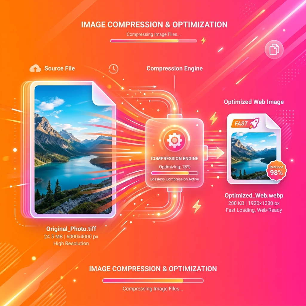
Image Optimization for the Web

Image optimization is not just lowering quality until a file becomes smaller. A sound strategy delivers the right dimensions, a suitable format, and enough visual quality for the context. It also avoids downloading images the visitor cannot see yet.
Judge the result inside the real page. An 80 KB image can be wasteful when displayed as an icon, while a 250 KB photograph may be reasonable for a large, sharp hero.
Begin with display dimensions
A common mistake is sending a 4000-pixel photograph into a 600-pixel container. CSS may make it look smaller, but the browser still downloads every original pixel.
Export close to the largest displayed size and provide variants for different screens. The srcset and sizes attributes, or an image component supplied by your framework, let the browser select an appropriate file. Keep the original outside the website so new sizes can be generated later.
Choose a format for the content
JPEG remains widely compatible and efficient for photographs that do not need transparency. PNG suits screenshots, diagrams, and graphics with sharp edges, but can be unnecessarily large for photographs.
WebP supports lossy and lossless compression, transparency, and animation. AVIF can make some photographs and complex graphics smaller, although encoding time and results vary. SVG is the natural choice for logos, icons, and vector shapes; it is not intended for photographs.
There is no universal winner. Compare visual output and file size with representative assets from your project. Converting to AVIF does not guarantee a smaller result when the settings are inappropriate.
Tune quality by looking at the result
Lossy compression removes information to reduce size. Begin at a moderate quality, inspect fine detail, gradients, faces, and text, and lower it gradually. Review the image at its actual display size rather than only zooming to 400 percent.
Lossless compression preserves pixels exactly, but a conversion may still remove metadata. Decide whether you need EXIF, color profiles, GPS coordinates, or camera details. Removing unnecessary metadata is sensible for public images, while working archives may need it.
Serve responsive variants
One file for every device forces a choice between wasting mobile data and losing sharpness on larger screens. Generate several widths, such as 480, 960, and 1600 pixels, and let the browser choose.
The sizes attribute should describe the space the image really occupies. If it always says 100vw while the design uses half the viewport, the browser may download a larger candidate than necessary.
Use lazy loading selectively
loading="lazy" delays images outside the initial viewport. It works well for galleries and content farther down the page, but should not be added blindly to the primary image. Delaying the resource likely to become the Largest Contentful Paint can make the page feel slower.
The main image needs declared dimensions so the browser reserves space. Secondary images can usually load lazily. Test the result with browser performance tools and a simulated mobile connection.
Prevent layout movement
Provide width and height, or reserve an aspect ratio in CSS. The browser can then allocate space before the file arrives. Without dimensions, text and controls may jump during loading and increase Cumulative Layout Shift.
A matching background color or small preview can improve some designs, but a blur placeholder should not add more code and transfer cost than it saves.
Build a repeatable workflow
Classify the asset as a photograph, screenshot, illustration, or vector. Resize it, remove unneeded metadata, generate a second format when it provides a real benefit, and create responsive variants. Finally, compare weight, dimensions, and appearance in the finished page.
The UtilX Image Converter, SVG Optimizer, and EXIF Viewer cover different parts of this workflow. Processing takes place in the browser, so assets do not have to be uploaded to an external transformation server.
Measure after publishing
Check transferred bytes, the served format, the candidate selected from srcset, the timing of the primary image, and layout movement. Lighthouse offers guidance, while the Network panel and real-user metrics reveal what each device actually received.
Sustainable optimization is not about one score. It is about ensuring that every visitor downloads the smallest image that preserves the quality the design requires, while the page remains stable as it loads.
Image optimisation is a content decision, not a quality slider. Photographs usually suit lossy JPEG, WebP, or AVIF; flat artwork and screenshots may need PNG; vector logos belong in SVG; transparent assets need verified alpha support; animations need their own format and frame checks. Pick a format from the source characteristics and the delivery context rather than converting every upload to one fashionable codec.
For a concrete product photograph at 2400 × 1600 pixels displayed in a 600-pixel card, create 480, 960, and 1600-pixel variants. Compare WebP and AVIF at the card’s actual size, retaining a JPEG fallback where the product requires it. Inspect thin edges, labels, gradients, and any transparent shadow. That export is not automatically appropriate for a flat icon, whose small dimensions and sharp edges call for a different source and comparison.
Start with the largest real display size and required aspect ratio, then resize from the original and produce responsive candidates. Use srcset with sizes that describes the layout width, and declare width and height or an aspect ratio so the browser reserves space. Apply loading="lazy" to below-the-fold images, not indiscriminately to the likely LCP image. Test the selection at mobile and desktop widths rather than assuming CSS scaling saves transferred bytes.
Codecs preserve different properties. Lossy compression removes detail and can create blocks, halos, or colour changes; chroma subsampling can harm coloured text and crisp edges. PNG preserves pixel values but can be heavy. WebP and AVIF support alpha, yet the result still depends on encoder settings and the source. Judge quality at published dimensions, not at a magnified preview, and compare byte size alongside visible defects.
Common failures include compressing an already lossy export a second time, serving a 4000-pixel image into a narrow container, and stripping metadata still needed by editorial workflows. Colour profiles can be ignored, EXIF rotation can surprise a converter, an animated source can lose frames, and a chosen format can lack needed support. Check the delivered visual result and transferred bytes; a correct filename extension proves neither.
Measure the resource the browser actually selected, its transferred size, CSS display size, and the timing of the main image. srcset cannot help when sizes declares 100vw for a half-width column. Review LCP, layout shifts, and caching in Network and with real-user data. Removing GPS or camera metadata can be prudent for public images, but retain the original and any information needed for rights or production.
Browser processing has memory and decoding limits. A small compressed file can expand substantially into pixels, and converting many photographs at once can stall a tab. Local conversion can avoid sending a file for that transformation, but it does not replace licence checks, accessibility work, device security, or a production pipeline for very large batches, complex animation, or colour-critical assets.
Before publishing, confirm format, alpha, and animation; verify dimensions, aspect ratio, srcset, sizes, width, and height; and view the page at mobile and desktop widths. Compare visual quality at real size, inspect metadata and orientation, check transferred bytes and LCP, and open the final variant in relevant browsers. Keep the editable original and record which export belongs in each placement.